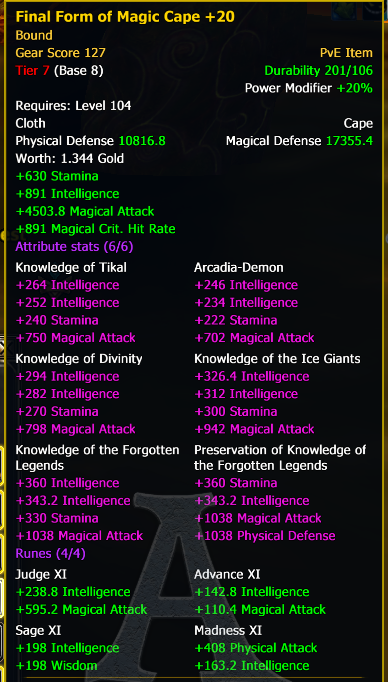
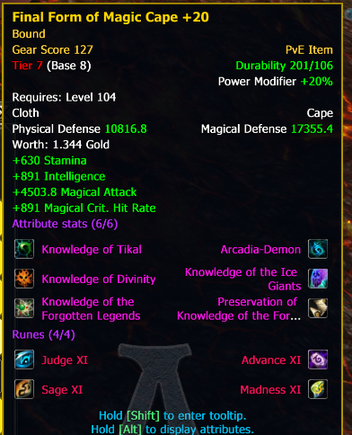
99 times out of 100, when you hover over an item you do not want to compare it with current equipment. Still, it steals a big part of your screen.
Example: drag a ring on an action bar to get the the speed buff when used. Result: your screen looks like this when you try to use the ring from the action bar:
Now imagine you want to do this during an instance, where you cannot afford not to know what is happening... This basically forces you to use a macro to use the ring which is just stupid.
Another example: you craft 200 belts to level armor crafting. Now ... try to sell them manually. With the HUGE tooltip with your current equipment it's soooo easy to misclick and sell something wrong (again, probably everyone uses some auto-selling addon but it's so silly that you are forced to do that because of over-tool-tipping...)
Or: you want to buy an item on AH for ISS. You really do not want to compare it with your current eq, and dep. on where the tooltip pops up it may make using auction house quite difficult...
Even if you are buying a replacement for your weapon on AH, 9 times out of 10 you know what you are looking for, you really do not need to see current eq...
Suggestion:
* do NOT show current eq in additional tooltips by default, just the item you hover over
* if user presses some key (say Shift? Alt?) only then show additionally current eq
My expectation: we will use the extra key 3 times a year: once to compare our eq with someone doing great or badly in an ini, once to search for new weapons on AH and the third case... I still need to come up with. ![]()
In other times current behavior is just pure inconvenience...


